
A quarter of a century of cancer data has revealed a silent revolution in cancer medicine. Our recent study found an impressive reduction in deaths from cancer across age groups over the last 25 years. But at the same time, we found an equally large increase in the occurrence of cancer across age groups. So what are these numbers telling us?
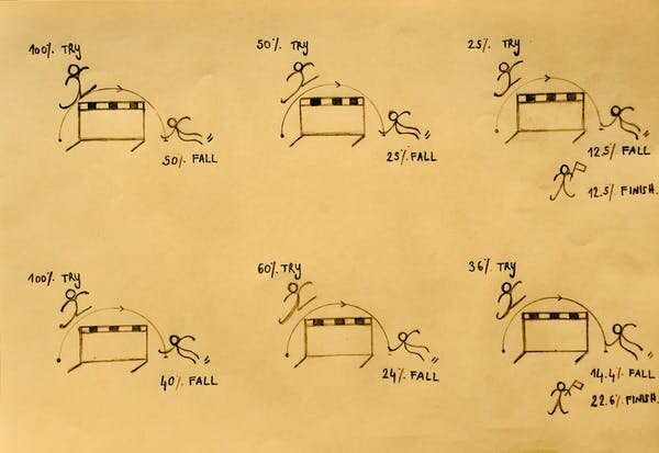
Suppose that a thousand people need to jump three consecutive hurdles. Whenever a person falls, they’re out. Now suppose that you observe very few people falling at the final hurdle. Is that because the last hurdle is really easy? Or because the first two hurdles are really hard? From these numbers, you can’t tell. The simple solution is to correct for the exposure to the risk of falling: for each hurdle, you divide the number of people that fall by the number of people that actually jumped.
In epidemiology, it works the same way: lifetime cancer risk often does not tell you very much. Suppose the first hurdle is dying of a heart attack at age 60. The second hurdle is dying of cancer at age 80. The third hurdle is dying of dementia at age 100. Whether you die of cancer then depends on whether you die of a heart attack first or not. And whether you die of dementia depends on whether or not you die from either a heart attack or cancer first. Advancements in cardiovascular health may therefore make cancer deaths go up, even if the cancer side of the story doesn’t really change.
Even more, if we moved the cancer hurdle to age 90, that would be an important change, even if people continued to die from cancer in the same numbers. So in order to study our success or failure at treating cancer, we need to account for exposure to cancer risk, and we need to account for age. As any epidemiologist will tell you, the way to do this is to study age-specific cancer rates, which account for both of these factors. So that’s what we did: we calculated age-specific cancer rates for occurrence (incidence) and death. We looked at data between 1990-2016 from Denmark, Norway, Sweden, Finland, Iceland, and the Netherlands, as they had longstanding, high-quality cancer registries.

Specific cancers may be affected by specific inventions (or lack thereof), and different cancers compete for research funding, hospital capacity and so forth. This may make the battle against some cancers more effective than the battle against others. Because we wanted to take a bird’s eye view on progress, we decided to just look at all cancers combined.
This showed us that over the last quarter of a century, cancer mortality decreased by 22% across almost all ages. Meanwhile, cancer incidence increased by 22% across almost all ages. All this happened gradually from 1990 to 2016.
So how can we understand these numbers? Why do higher cancer incidence and lower cancer mortality go hand-in-hand? We think, with some caution, that earlier and better diagnoses, in combination with better treatment, is the reason cancer mortality rates went down—and why diagnoses went up. Better treatments could be because of improvements in a patient’s treatment plan, or because the same patient today is in better overall health than 26 years ago. Better overall health may mean they can better withstand harsher cancer treatments, which may therefore be more successful.
Either way, it seems that over 26 years, the myriad small and large inventions, protocols, national cancer plans and increased awareness, perhaps together with equally incremental improvements in overall health, have added up to a very simple thing: cancer incidence up by 22%, cancer mortality down by 22%. This is three quarters of a percent per year. Perhaps not the result of one clear intervention, but many bricks together build a house.
Source: Read Full Article